


For this Data Science project, I will analyze data on GDP and life expectancy from the World Health Organization and the World Bank to try and identify the relationship between the GDP and life expectancy of six countries.
You can use Jupyter Notebook or Google Colab for this project, so you’ll don’t have to install any packages.
Now, let’s load the CSV file into a pandas dataframe and take a look at the first few rows to get an idea of the data:
import pandas as pd

df = pd.read_csv("all_data.csv")
print(df.head())
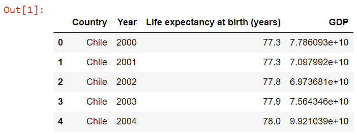
From the output, we can see that the data contains information on life expectancy and GDP of different countries, spanning multiple years.
Now, let’s take a look at the summary statistics of the numerical columns using the describe() function:
import pandas as pd

df = pd.read_csv("all_data.csv")
print(df.head())
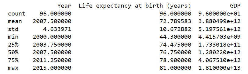
From the output, we can see that the dataset contains information from the year 2000 to 2015. The mean life expectancy at birth is around 72 years and the mean GDP is around 3.8B. The standard deviation of both columns is quite high, indicating a wide range of values. We can also see that the GDP column has some missing values.
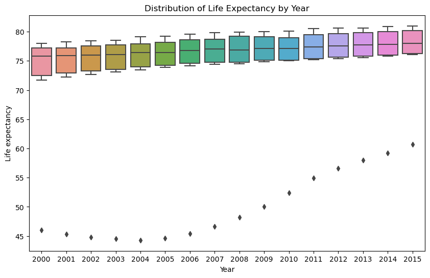
Now, let’s create a box plot to visualize the distribution of life expectancy across different years:
import seaborn as sns

plt.figure(figsize=(10, 6))
sns.boxplot(x='Year', y='Life expectancy at birth (years)', data=df)
plt.xlabel('Year')
plt.ylabel('Life expectancy')
plt.title('Distribution of Life Expectancy by Year')
plt.show()
Let’s now check if the life expectancy increased over time in the six nations.
plt.figure(figsize=(10, 6))
sns.lineplot(x='Year', y='Life expectancy at birth (years)', data=df)
plt.xlabel('Year')
plt.ylabel('Life expectancy')
plt.title('Life Expectancy over Time')
plt.show()
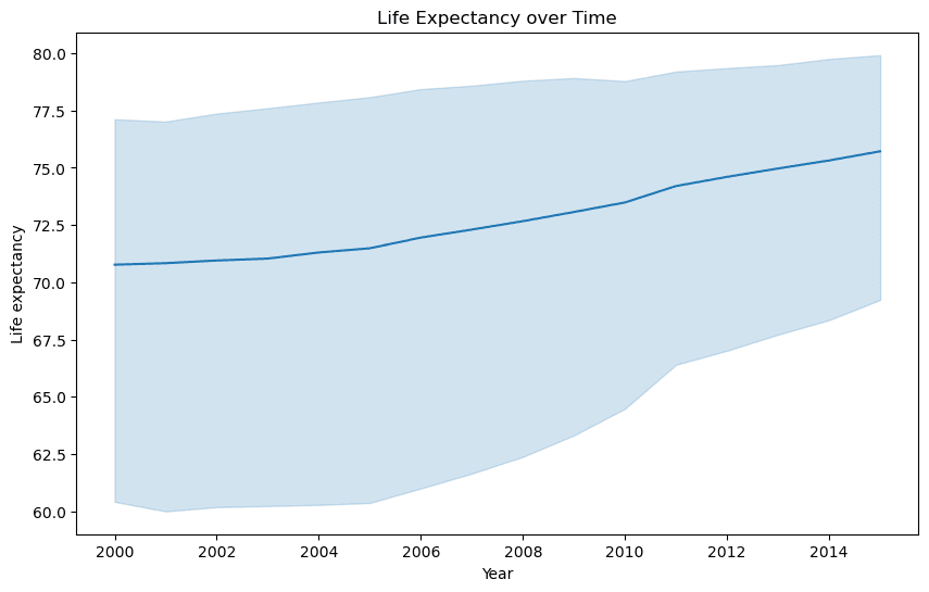
From the line plot, we can see that life expectancy has generally increased over time in the dataset, with a slight dip in the early 2000s.
Has GDP increased over time in the dataset?
plt.figure(figsize=(10, 6))
sns.lineplot(x='Year', y='GDP', data=df)
plt.xlabel('Year')
plt.ylabel('GDP')
plt.title('GDP over Time')
plt.show()
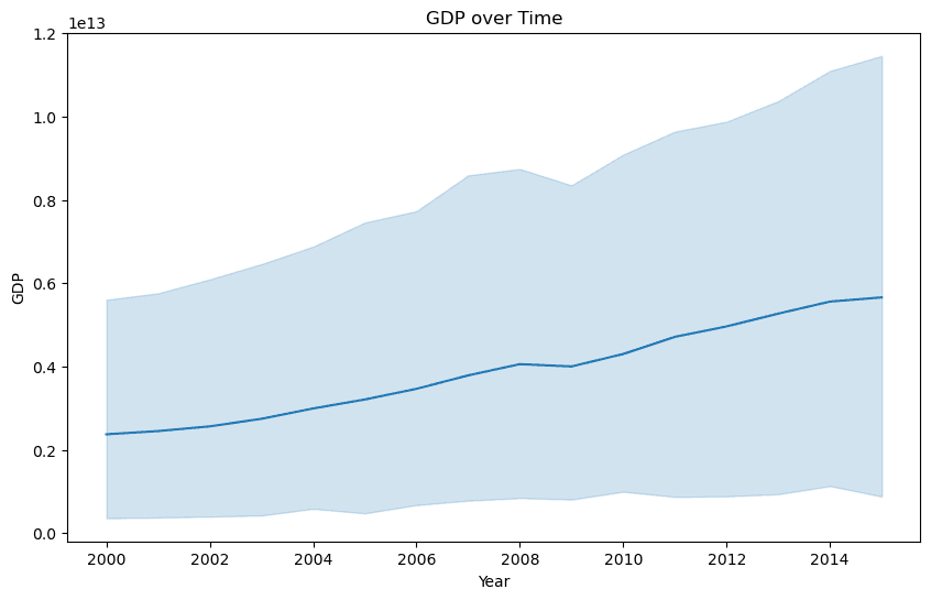
From the line plot, we can see that GDP has generally increased over time in the dataset, with a slight dip during the global financial crisis of 2008-2009.
Is there a correlation between GDP and life expectancy of a country?
To answer this question, we can create a scatter plot of GDP versus life expectancy:
plt.figure(figsize=(10, 6))
sns.scatterplot(x='GDP', y='Life expectancy at birth (years)', data=df)
plt.xlabel('GDP')
plt.ylabel('Life expectancy')
plt.title('GDP vs. Life Expectancy')
plt.show()
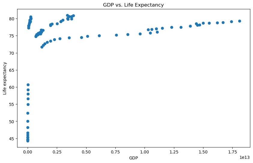
From the scatter plot, we can see that there is a positive correlation between GDP and life expectancy. Countries with higher GDP tend to have higher life expectancy.
What is the average life expectancy in the dataset?
To answer this question, we can use the mean() function:
print("Average life expectancy:", df['Life expectancy at birth (years)'].mean())
Output:
Average life expectancy: 72.78958333333335What is the distribution of life expectancy in the dataset?
To answer this question, we can create a histogram of life expectancy:
plt.figure(figsize=(10, 6))
sns.histplot(x='Life expectancy at birth (years)', data=df, bins=20)
plt.xlabel('Life expectancy')
plt.ylabel('Count')
plt.title('Distribution of Life Expectancy')
plt.show()
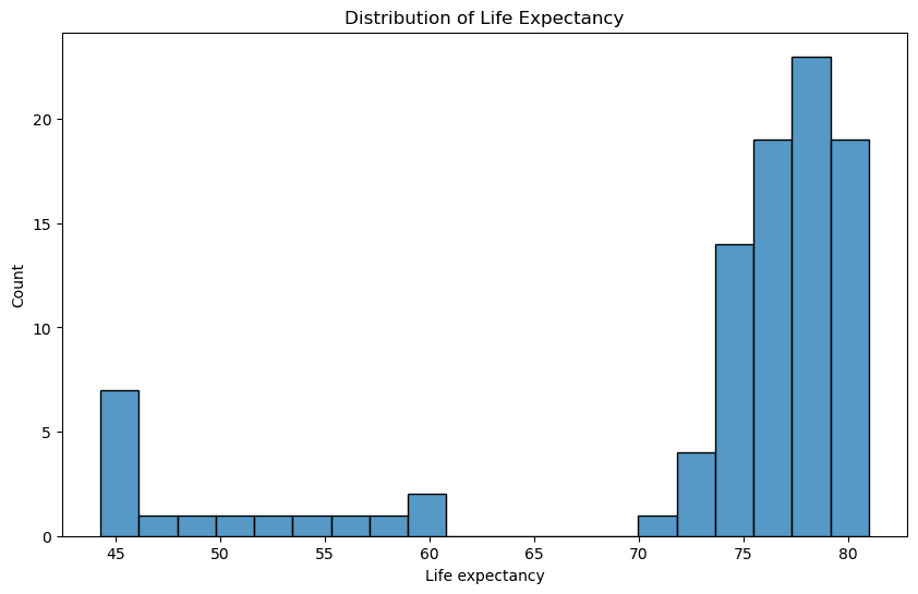
From the histogram, we can see that the distribution of life expectancy is roughly normal with a peak around 77-78 years.