


There are many Python libraries for plotting charts. The popular ones include Matplotlib, Seaborn, and Plotly. This chapter focuses on the Matplotlib library. We’ll also briefly discuss some plotting methods in the pandas library that rely on Matplotlib in the background.
What is Matplotlib?
Matplotlib is a free and open-source plotting library for the Python programming language. It is one of the most popular libraries for data visualization and provides us with two interfaces for plotting graphs – the object-oriented (OO) and pyplot interface.
The OO interface allows us to work directly with Matplotlib’s objects (such as the Figure and Axes objects) and gives us greater control over the designs of our charts. The pyplot interface, on the other hand, is designed to emulate a popular plotting software called MATLAB and is easier to use.
The pyplot interface is more popular. Therefore, this chapter focuses on the pyplot interface. In the last part of the chapter, we’ll briefly discuss the OO interface and learn about the added flexibility it offers.
Using matplotlib.pyplot
To use the pyplot interface, we need to import the matplotlib.pyplot module. Create a new notebook called Chapter 4 – Matplotlib.ipynb and run the following commands:
import numpy as np
import pandas as pd
import matplotlib.pyplot as plt
%matplotlib inline
Here, we first import the NumPy and pandas libraries. Next, we import the matplotlib.pyplot module using the plt alias and add the line %matplotlib inline to specify the backend.
The backend is responsible for the actual rendering of the chart.
Matplotlib allows us to specify the structure of our chart (such as whether we want to plot a scatter plot or a bar chart, what data to use, what title it should have, and so on) but does not generate the chart itself.
To generate the chart, it relies on a user-specified backend. When we write %matplotlib inline, we specify that we want Matplotlib to use Jupyter’s own backend to generate the chart. With this backend, the chart is plotted within the notebook itself.
Plotting a Scatter Plot
Now, let’s learn to plot a scatter plot. A scatter plot helps show the relationship between two variables and can assist us in narrowing down the types of machine learning models to build.
To plot a scatter plot, we use the scatter() function in Matplotlib. Most functions in Matplotlib accept 1D array-like structures as input. In the examples below, we use Python lists to illustrate. Besides Python lists, we can use NumPy arrays or pandas Series.
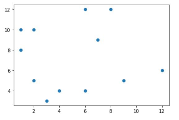
sp_x = [2, 3, 4, 6, 2, 8, 6, 9, 12, 1, 7, 1]
sp_y = [10, 3, 4, 12, 5, 12, 4, 5, 6, 8, 9, 10]
plt.scatter(sp_x, sp_y)
plt.show()
Here, we declare and initialize two lists sp_x and sp_y for the x and y values of the scatter plot, respectively. Next, we pass the two lists to the scatter() function and call the show() function to display the chart.
Calling show() is optional in a Jupyter Notebook as Jupyter automatically displays the plot when we execute the code. Therefore, we’ll omit this command in subsequent examples. If you are not using Jupyter Notebook and the chart does not display, you’ll need to use the show() function.
If you run the code above, you’ll get the following plot:
Plotting a Bar Chart
Next, let’s move on to bar charts. To plot a bar chart, we use categorical data.
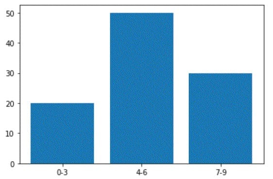
b_x = ['0-3', '4-6', '7-9']
b_y = [20, 50, 30]
plt.bar(b_x, b_y)
In the code above, we declare two lists – b_x and b_y.
b_x consists of three categories (‘0-3’, ‘4-6’, and ‘7-9’) and b_y consists of some measured values corresponding to the three categories. For instance, if b_x represents age groups, b_y may represent the number of children in each group.
To plot a bar chart, we pass b_x and b_y to the bar() function for the x and y values, respectively. If you run the code above, you’ll get the following chart:
Plotting a Histogram
A histogram looks similar to a bar chart but is more suitable for non-categorical data. It is commonly used to show frequency distributions.
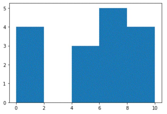
h_x = [7, 7, 7, 1, 1, 0, 0, 4, 5, 5, 6, 6, 8, 9, 9, 10]
plt.hist(h_x, bins=5)
In the example above, we declare a list h_x with values from 0 to 10. Next, we use the hist() function to plot a histogram, specifying the number of bins as 5. With bins = 5, the range of h_x (0 to 10) is divided into 5 equal-width bins.
The first bin is from 0 to 2 (including 0 but excluding 2), the second is from 2 (inclusive) to 4 (exclusive), and so on, while the last bin is from 8 (inclusive) to 10 (inclusive). The height of each bar represents the frequency (i.e., the number of elements within each interval).
The code above gives us the following histogram:
Specifying the number of bins is optional when plotting a histogram in Matplotlib. In this example, if we do not specify the number of bins, the function plots one bar for each number from 0 to 10.
Plotting a Line Graph
To plot a line graph, we use the plot() function. Suppose we have the following lists:
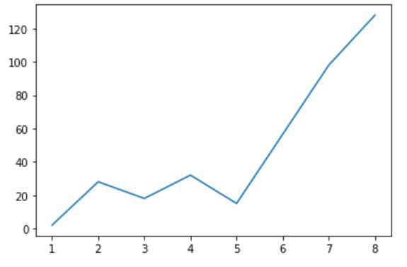
l_x = [7, 1, 4, 8, 5, 2, 3]
l_y = [98, 2, 32, 128, 15, 28, 18]
If we pass these two lists to the plot() function:
plt.plot(l_x, l_y)
we’ll get the following graph:
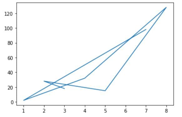
The plot() function joins the points in the graph based on the order of the elements in the first list (which represent the x values). In the code above, the first list is [7, 1, 4, 8, 5, 2, 3]. Hence, the first point for the graph is at x = 7. This point is joined to the second point at x = 1, followed by the third point at x = 4 and so on, resulting in a weird looking graph.
To plot the graph correctly, we need to sort the points before passing them to the function. This can be done using the code below:
zipped = zip(l_x,l_y)
sorted_zip = sorted(zipped)
l_x, l_y = zip(*sorted_zip)
Here, we first pass l_x and l_y to a built-in Python function called zip(). This function pairs the corresponding elements in l_x and l_y as tuples and returns a zip object, which we assign to a variable called zipped.
zipped consists of the following tuples: (7, 98), (1, 2), (4, 32), (8, 128), (5, 15), (2, 28), and (3, 18), which are not sorted.
We pass zipped to the Python sorted() function to sort the tuples and assign the resulting list – [(1, 2), (2, 28), (3, 18), (4, 32), (5, 15), (7, 98), (8, 128)] – to a variable called sorted_zip.
The tuples are now sorted, and we need to “unzip” them. To do that, we use the zip() function again. However, this time we pass the sorted list to the zip() function using the * operator.
As a result, the zip() function returns two tuples, which we assign back to l_x and l_y. If you print the values of l_x and l_y now, you’ll get the following output:
(1, 2, 3, 4, 5, 7, 8)
(2, 28, 18, 32, 15, 98, 128)
We can now pass l_x and l_y to the plot() function again:
plt.plot(l_x, l_y)
This gives us the following line graph:
Using pandas
plot()
In the section above, we learned to plot charts using the pyplot interface. If our data is stored in a pandas Series or DataFrame, in addition to the pyplot interface, we can use the plot() method in pandas to plot our charts.
This method uses Matplotlib in the background by default and is very similar to the pyplot functions discussed above.
However, there are two major differences. Firstly, pyplot functions do not label the charts we plot, but the pandas plot() method does. Secondly, instead of having separate functions for different types of charts, the pandas plot()method uses the kind parameter.
Let’s look at an example.
In the “Plotting a Scatter Plot” section above, we used plt.scatter(sp_x, sp_y) to plot a scatter plot for sp_x and sp_y.
To do the same in pandas, we use the code below:
sp_x = [2, 3, 4, 6, 2, 8, 6, 9, 12, 1, 7, 1]
sp_y = [10, 3, 4, 12, 5, 12, 4, 5, 6, 8, 9, 10]
df = pd.DataFrame({'A':sp_x, 'B':sp_y})
df.plot(kind='scatter', x='A', y='B')
Here, we first create a DataFrame df with two columns, A and B. Next, we use the DataFrame to call the pandas plot() method, passing kind=’scatter’ to specify the chart type, and x=’A’, y=’B’ to specify the columns for the x and y axes, respectively.
If you run this example, you’ll get a scatter plot that is very similar to Figure 4.1 above. However, the plot() method labels the axes of a scatter plot using labels of the columns used to plot the chart. Therefore, this new scatter plot’s x and y axes will be labeled “A” and “B”, respectively.
Next, let’s look at how we can use the pandas plot() method to plot a bar chart and a line graph:
Plotting a Bar Chart
b_x = ['0-3', '4-6', '7-9']
b_y = [20, 50, 30]
df = pd.DataFrame({'A':b_x, 'B':b_y})
df.plot(kind='bar', x='A', y='B')
Plotting a Line Graph
l_x = [7, 1, 4, 8, 5, 2, 3]
l_y = [98, 2, 32, 128, 15, 28, 18]
df = pd.DataFrame({'A':l_x, 'B':l_y})
df = df.sort_values(['A'])
df.plot(kind='line', x='A', y='B')
These examples should be self-explanatory. We pass kind=’bar’ and kind=’line’ to the plot() method to plot a bar chart and a line graph, respectively. To specify the x and y values, we use the x and y parameters. For the line graph, we sort the DataFrame using the x values before calling the plot() method.
If you run the examples, you’ll get a bar chart that looks very similar to Figure 4.2 and a line graph that looks very similar to Figure 4.5.
Finally, let’s learn to plot a histogram using the pandas plot() method. For histograms, we do not specify the x and y parameters. Instead, we use the column (df[‘A’]) to call the method:
h_x = [7, 7, 7, 1, 1, 0, 0, 4, 5, 5, 6, 6, 8, 9, 9, 10]
df = pd.DataFrame({'A':h_x})
df['A'].plot(kind='hist', bins=5)